Your site is live, your treatment menu is polished, and your “Book Now” button is sitting there… untouched. If your online bookings are quieter than they should be, this post is for you.
Let’s unpack exactly why your site isn’t converting visitors into clients, and what you can do to change that. Because it’s not just about having a button. It’s about making that button irresistible.
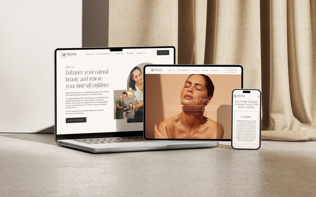
Your website is working against you
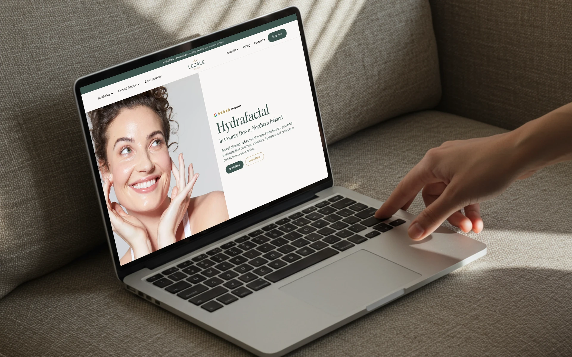
Before anyone clicks “Book Now,” they’re looking for signs they can trust you. If your site loads slowly, looks dated, or feels hard to navigate, you’re creating doubt before they’ve even found your treatment page.
Your website design should feel as polished and premium as the clinic experience you offer in person. That doesn’t mean flashy, it means clear, confident, and user-focused. Strategic design that gently guides people where they need to go, like right to that booking link.
Your copy isn’t doing the heavy lifting
Looks matter, but words do the work. If your homepage talks more about what you do than why it matters, or your treatment descriptions are a sea of jargon, you’re missing a massive opportunity to connect.
Want people to click? Speak directly to the pain points they’re feeling and the results they’re craving. Your copy should sound like a conversation with your dream client, not a technical manual.
Need help? Let’s fix that.
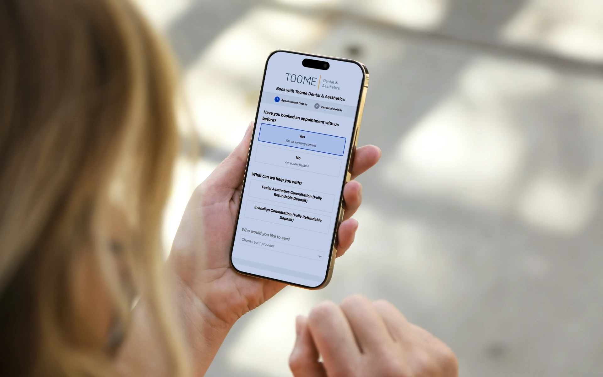
You’re not guiding them to take action
Calls to action should show up often and feel natural. Not just a lone “Book Now” floating in your header. Think buttons after every key section, with variations like:
- “See available appointments”
- “Book your consultation”
- “Start your treatment journey”
You’re not being pushy. You’re being helpful. Make it easy for someone who’s ready to say yes, right now.
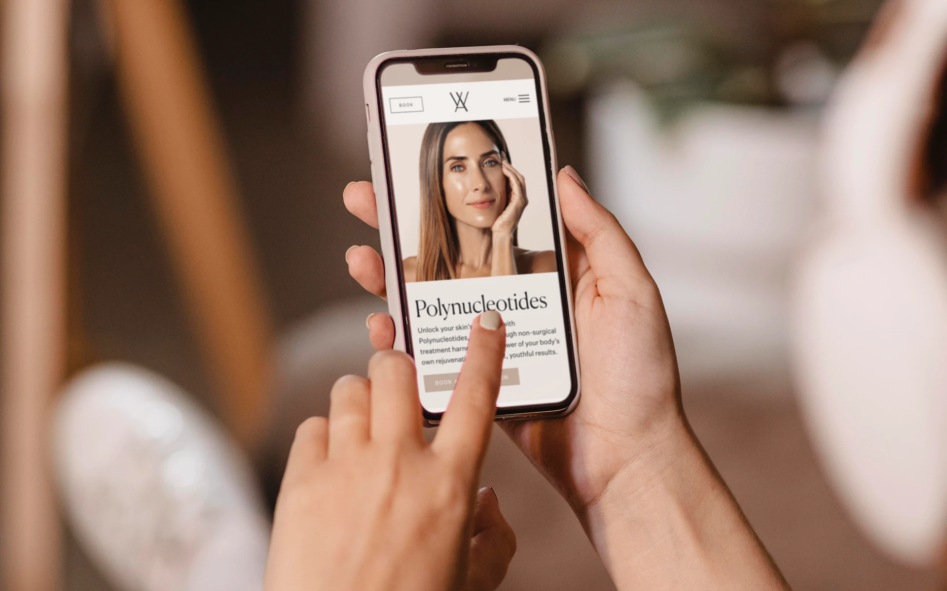
Your pricing is vague or hidden
If you’re making people work to find out how much something costs, many won’t bother. Worse, they may assume you’re overpriced or hiding fees. That’s a trust killer.
Being transparent doesn’t mean listing every package. It means giving enough info for someone to feel confident booking. Check out our post No One Wants to DM for Prices for a deeper dive on this.
Your site doesn’t feel like you
Maybe you’ve got the basics right, but the vibe is off. The colours feel generic, the photos are old, and your tone doesn’t match the real experience of being in your clinic. People can sense that disconnect.
Today’s clients are savvy. They don’t just book treatments, they book people. Your brand should build that bridge.
If your visuals and voice aren’t working together to tell your story, you’re leaving money on the table.
So, what next?
If you’re reading this and nodding along, here’s the good news: all of this is fixable. You don’t need to start from scratch, but you do need a site that’s built with strategy, not just aesthetics.
At The Design Clinic, we help aesthetic, dental, and healthcare clinics create websites that reflect their expertise, connect with the right people, and yes, get that “Book Now” button clicked.
Need one that finally works?